Post Luxembourg
PackUp
How to bring, with a sense of humour, a very innovative product?
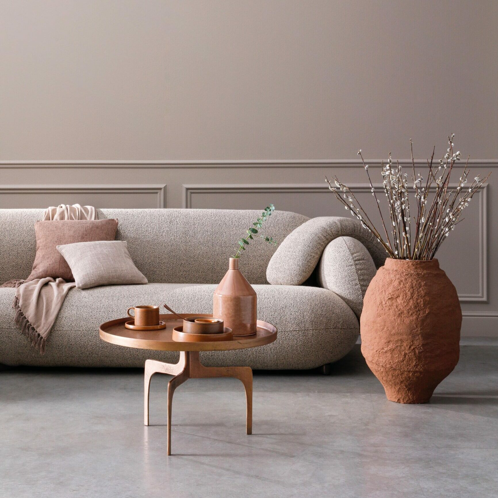
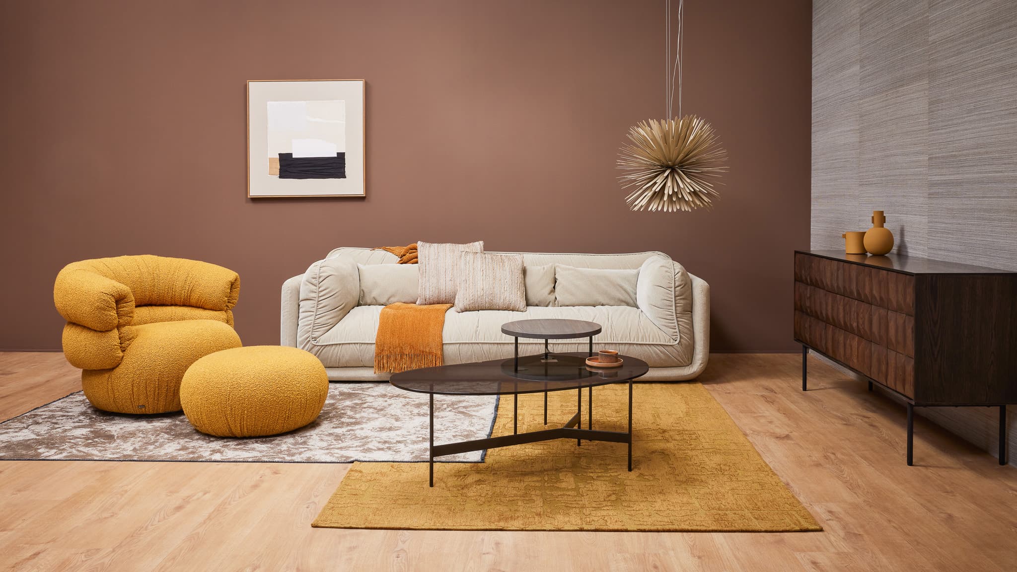
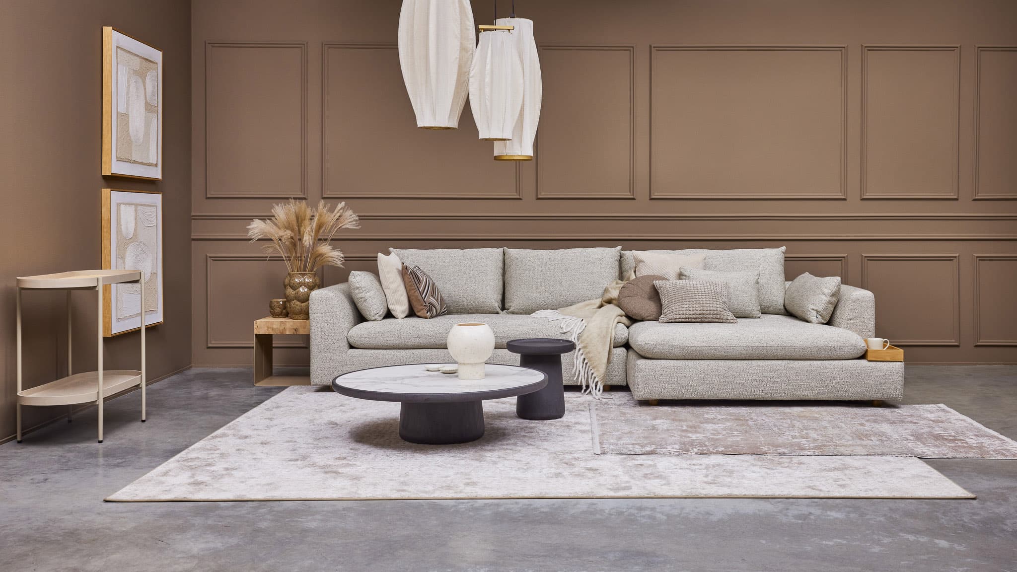
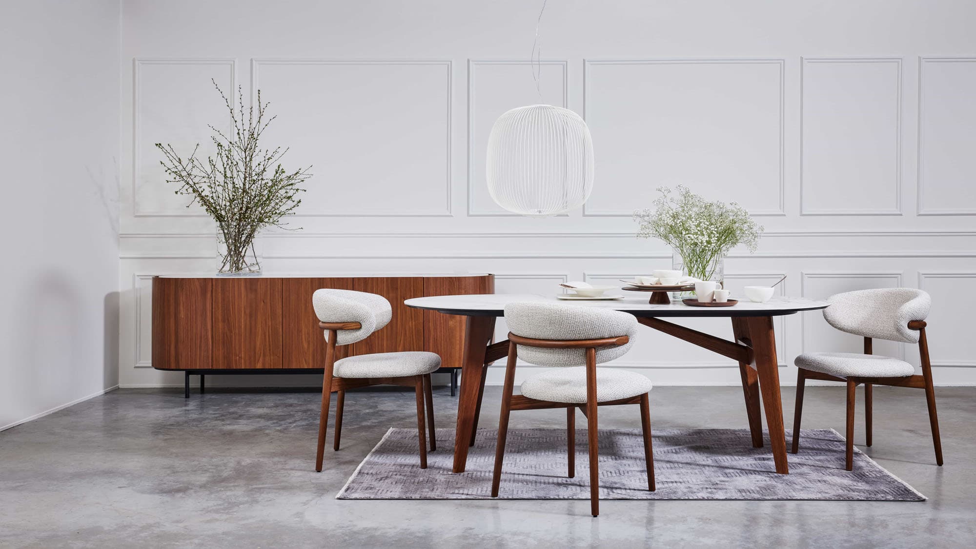
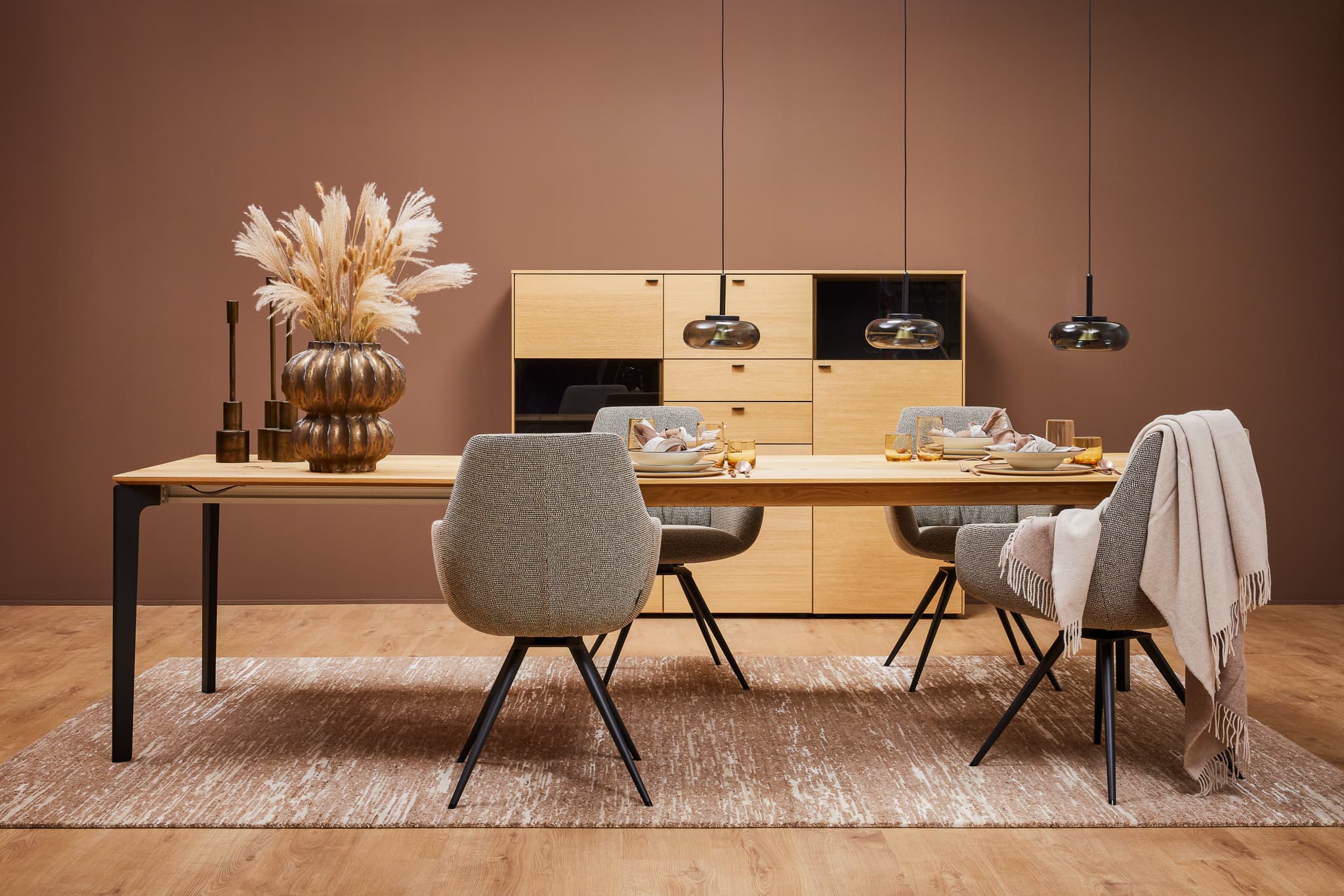
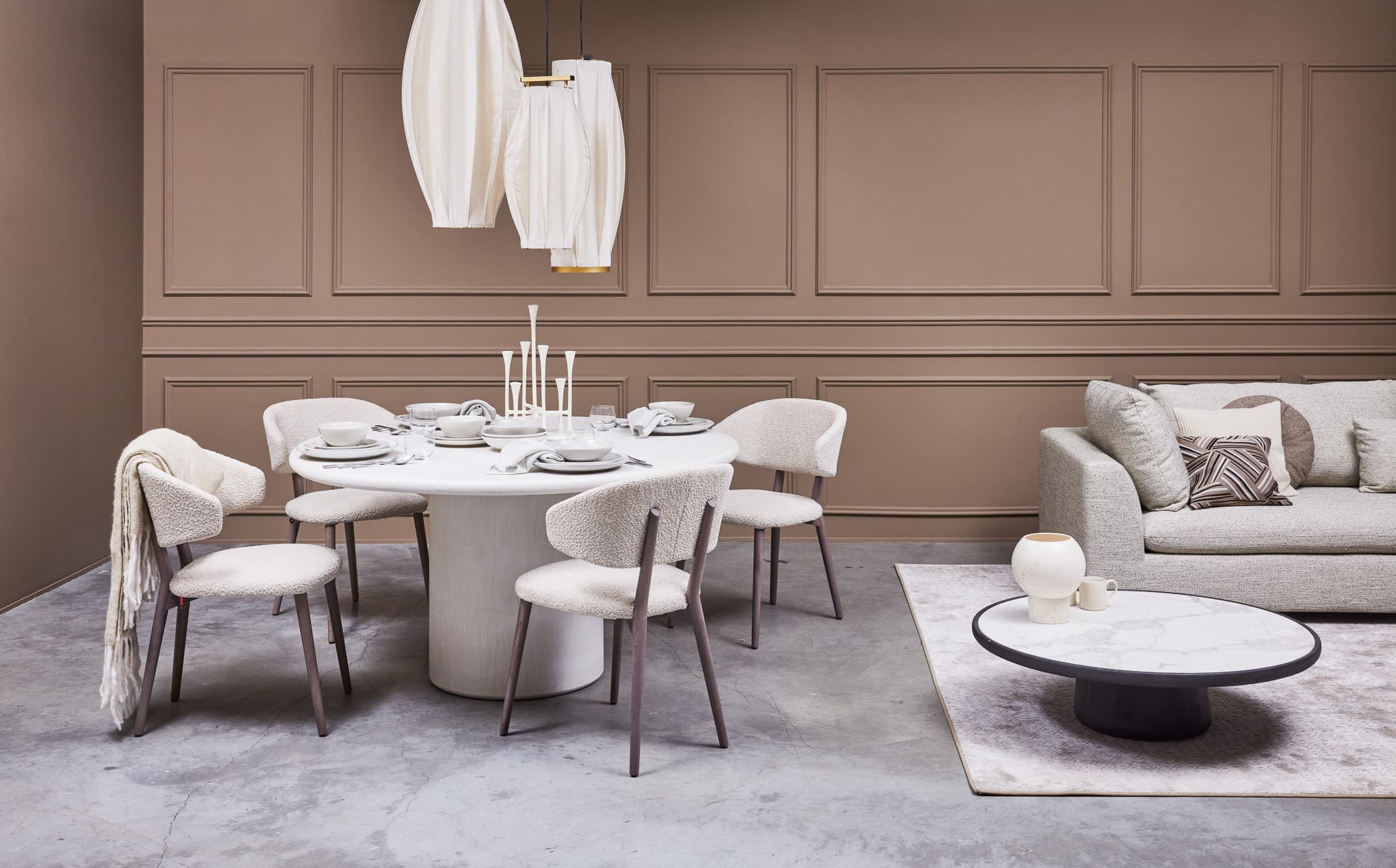
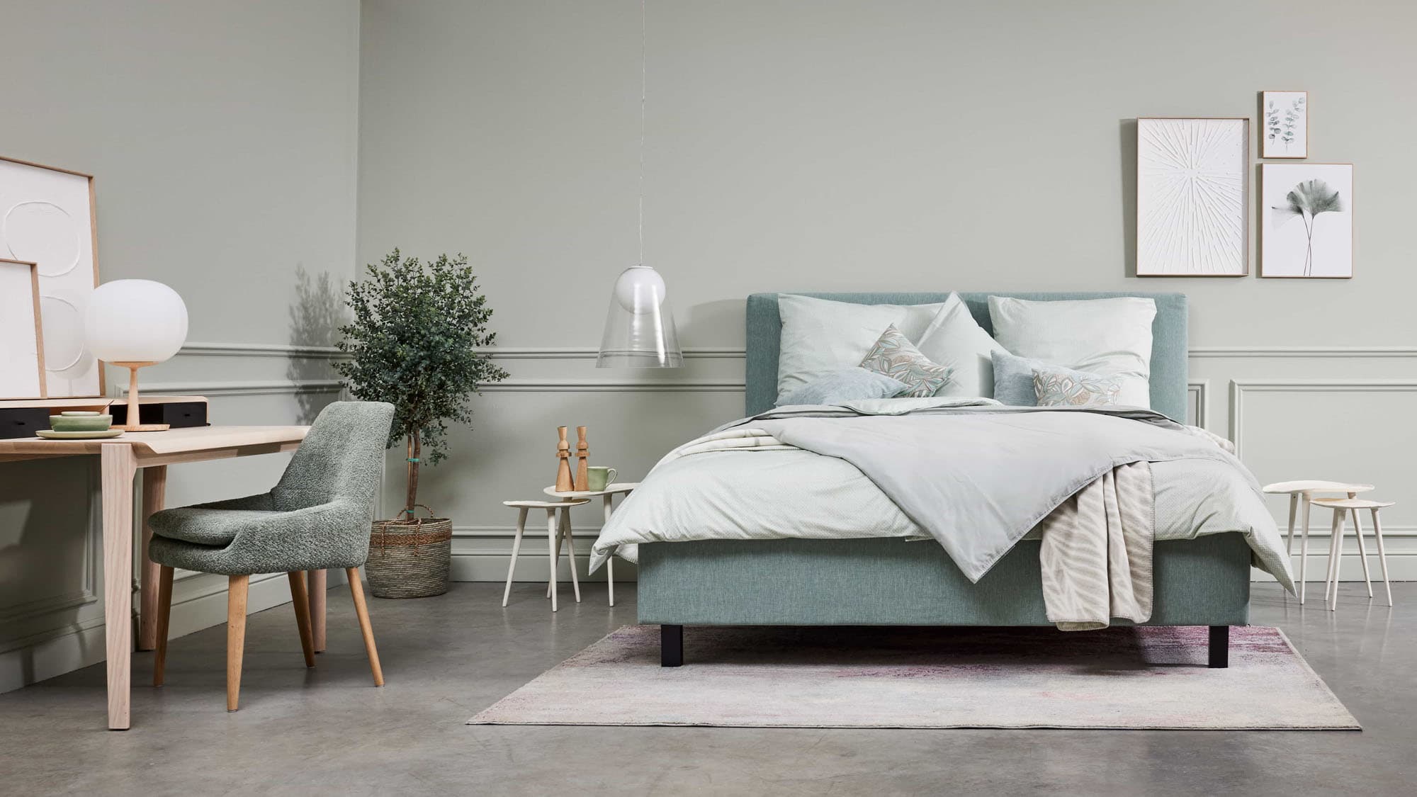
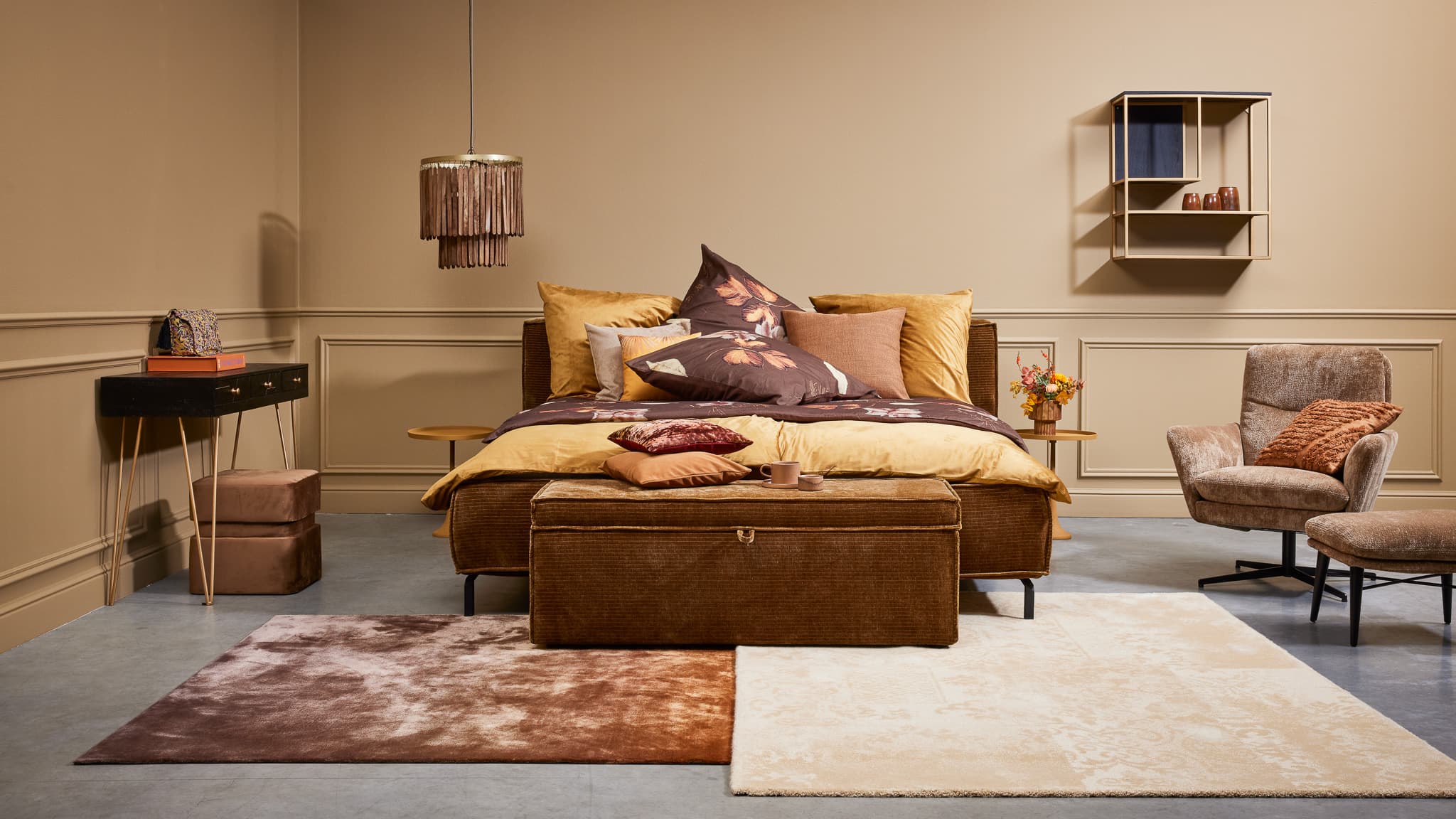
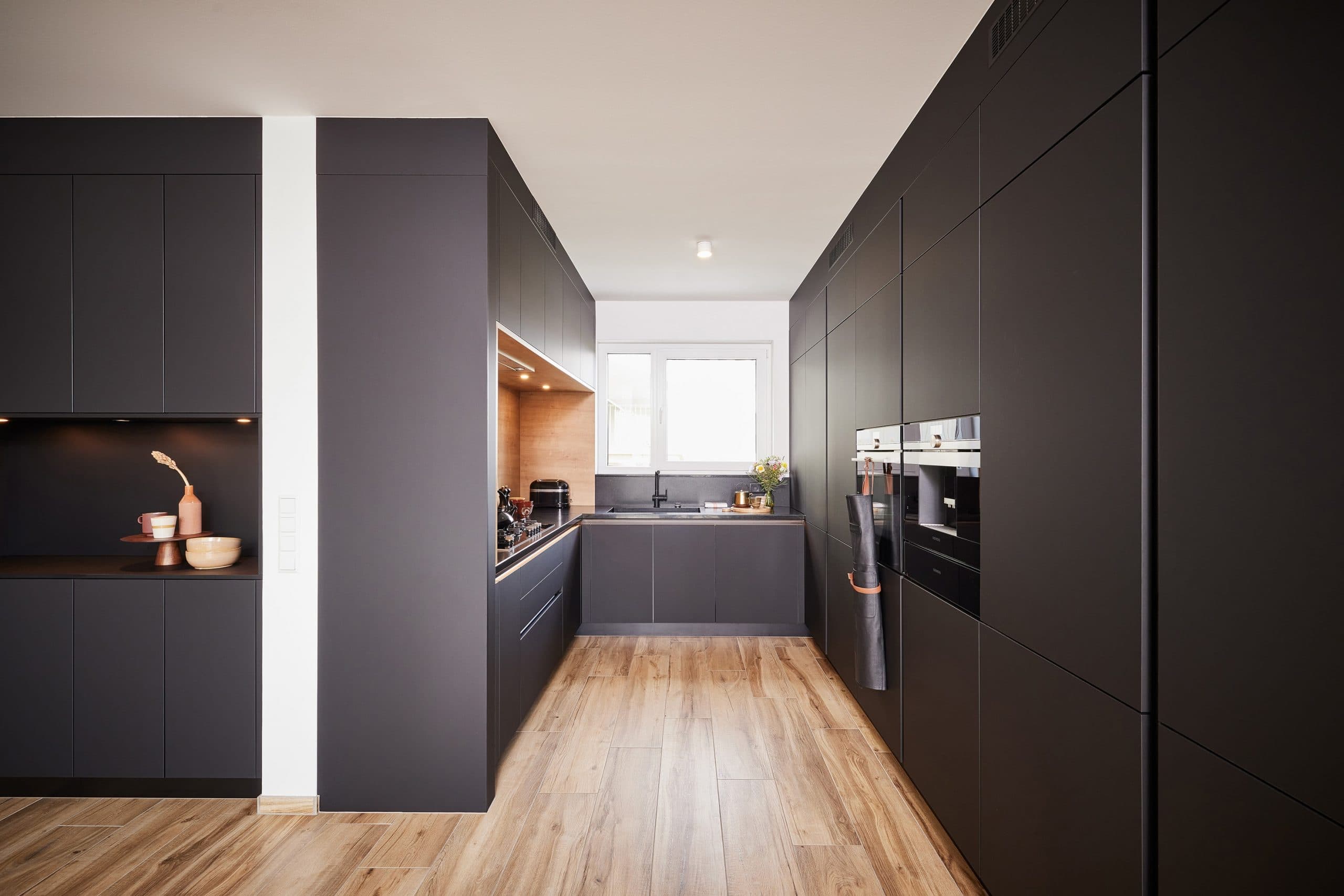
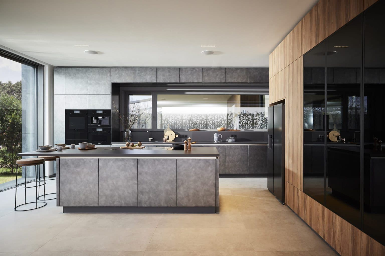
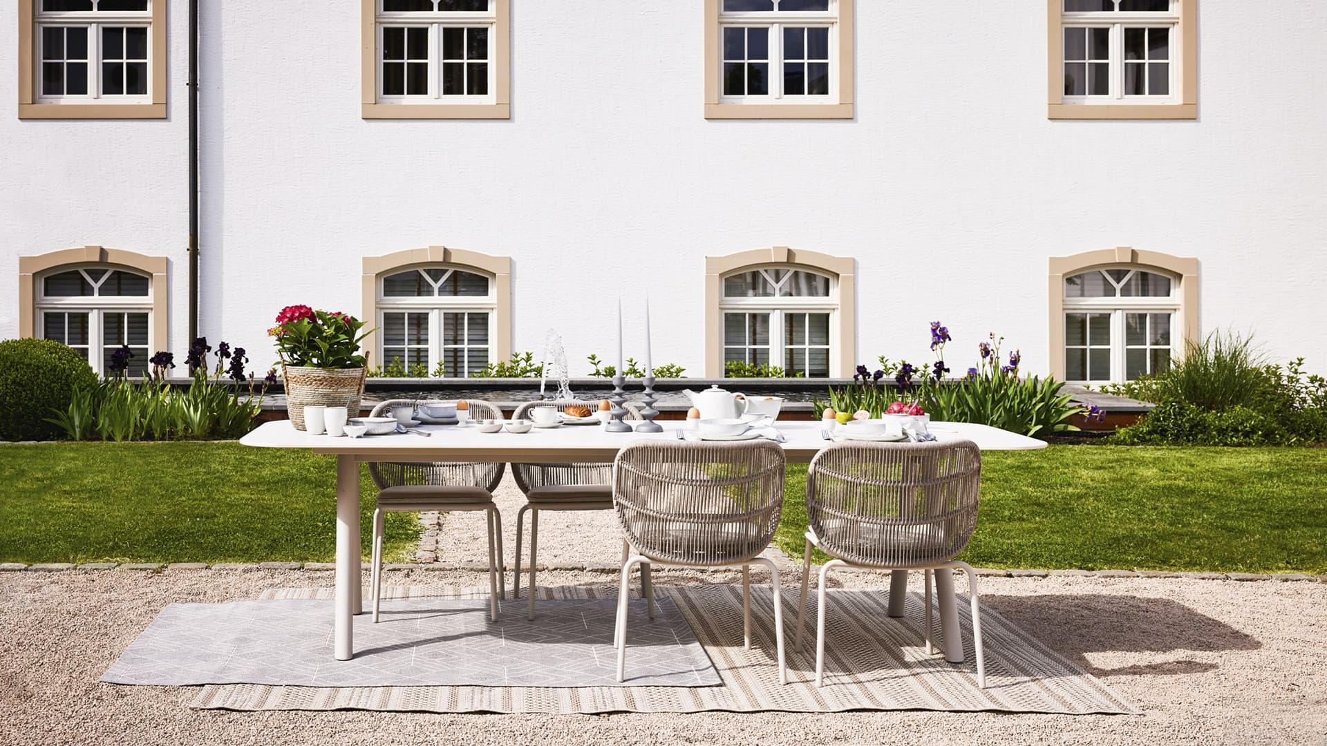
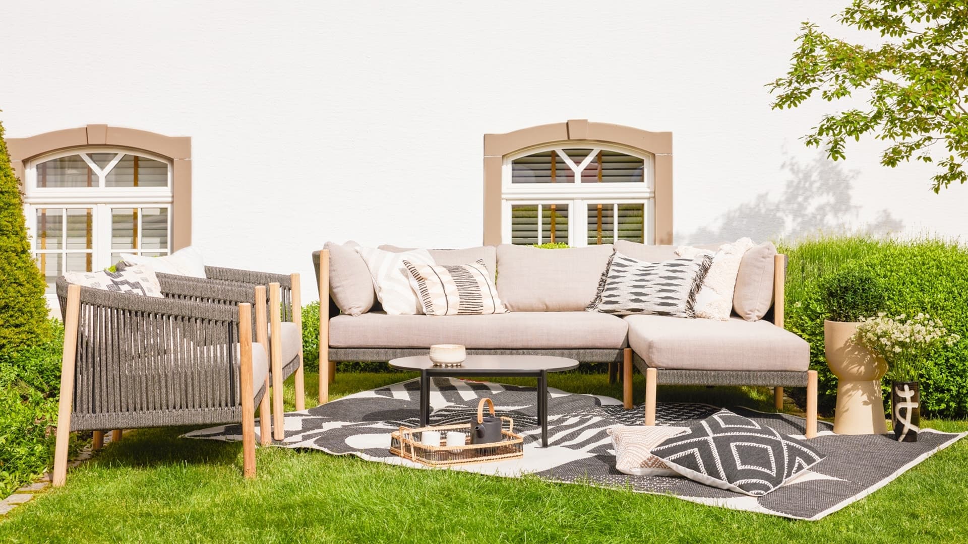
Building on its 40-year history and reputation for unrivaled quality, Kichechef, the largest furniture store in the Greater Region, has embarked on a journey of transformation. With an impressive surface area of 38,000 square meters, the company decided to refresh its visual identity and redefine its strategic positioning and communication. This bold work was carried out by our teams, determined to breathe new life into the brand.
The main objective of this rebranding was to better reflect the values and spirit of Kichechef, while creating an emotional experience for customers.
The new brand baseline “Home Sweet Home” embodies this transformation, inviting customers to feel at home from the moment they walk through the store doors.
The ultimate goal was to strengthen the emotional connection with the brand and position Kichechef as more than just a furniture store, but as a destination where you truly feel at home.
The first step in this strategic evolution was the creation of a new logo, retaining the fundamental elements of Kichechef’s DNA, while adopting a more contemporary aesthetic. This new visual identity was reinforced by a media campaign highlighting the “Home Sweet Home” positioning.
An emotional television and cinema spot was designed to capture the essence of this transformation, while the campaign was rolled out in print, radio and social media to ensure omnichannel visibility.
At the same time, the Kichechef website has been completely redesigned to offer a simpler, more functional experience and in harmony with the brand’s new strategy.

How to bring, with a sense of humour, a very innovative product?